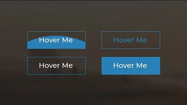
In this project, we’ll be creating four different CSS button styles that utilize 2024 CSS button techniques, each featuring unique hover effects. These buttons will not only change color but also showcase smooth background animations triggered when the user hovers over them.
Let’s break down how these buttons are structured and how we can make them stand out with CSS animations.
Step 1: Setting Up the HTML
We’ll start by writing the basic HTML structure for our buttons. Here’s the code:
This basic HTML structure contains four buttons, each assigned a unique class (btn1, btn2, btn3, btn4). The CSS will target these classes to apply different styles and effects.
<!DOCTYPE html>
<html lang="en" dir="ltr">
  <head>
    <meta charset="utf-8">
    <title>Button Hover Effects</title>
    <link rel="stylesheet" href="style.css">
  </head>
  <body>
    <div class="container">
      <button class="btn btn1">Hover Me</button>
      <button class="btn btn2">Hover Me</button>
      <button class="btn btn3">Hover Me</button>
      <button class="btn btn4">Hover Me</button>
    </div>
  </body>
</html>
Step 2: Styling the Buttons with CSS
Next, we’ll define the styles for our buttons in the style.css file. We will use properties like position, overflow, transition, and before pseudo-elements to create the hover effects. These styles are perfect for creating CSS buttons that look modern and appealing.
Here’s the CSS code that makes the magic happen:
body {
  margin: 0;
  padding: 0;
}

.container {
  text-align: center;
  margin-top: 360px;
}

.btn {
  border: 1px solid #3498db;
  background: none;
  padding: 10px 20px;
  font-size: 20px;
  font-family: "Montserrat", sans-serif;
  cursor: pointer;
  margin: 10px;
  transition: 0.8s;
  position: relative;
  overflow: hidden;
}

/* Text color for buttons */
.btn1, .btn2 {
  color: #3498db;
}
.btn3, .btn4 {
  color: #fff;
}

/* Hover effect - text color change */
.btn1:hover, .btn2:hover {
  color: #fff;
}
.btn3:hover, .btn4:hover {
  color: #3498db;
}

/* Background animation */
.btn::before {
  content: "";
  position: absolute;
  left: 0;
  width: 100%;
  height: 0%;
  background: #3498db;
  z-index: -1;
  transition: 0.8s;
}

/* Button-specific background animation directions */
.btn1::before, .btn3::before {
  top: 0;
  border-radius: 0 0 50% 50%;
}
.btn2::before, .btn4::before {
  bottom: 0;
  border-radius: 50% 50% 0 0;
}
.btn3::before, .btn4::before {
  height: 180%;
}
.btn1:hover::before, .btn2:hover::before {
  height: 180%;
}
.btn3:hover::before, .btn4:hover::before {
  height: 0%;
}
Breaking Down the Code
- Container Styling
- The
.containerclass centers all buttons on the page.
- The
- Button Base Styling
- The
.btnclass applies essential styles such as border, padding, font, and a smooth transition effect for button hover actions.
- The
- Button Color and Hover Effects
.btn1and.btn2: Start with a blue border and text color. On hover, the background fills with blue, and the text color turns white. This showcases the css adjust button text color technique beautifully..btn3and.btn4: Start with a white text color. On hover, the text turns blue, and the background disappears.
- Background Animation with
::before- The hover effect is achieved using the
::beforepseudo-element. It’s positioned behind the button’s text and expands to fill the button when hovered. .btn1and.btn3: The background starts from the top and expands downward..btn2and.btn4: The background starts from the bottom and expands upward.
- The hover effect is achieved using the
Step 3: Testing and Customizing
Now that the buttons are styled, open your HTML file in a browser to see the hover effects in action. Each button will smoothly change its background and text color when hovered, creating an eye-catching effect.
Feel free to customize:
- Colors: Change
#3498dbto any color of your choice. - Fonts: Swap out the Montserrat font for another that suits your design.
- Button Shape: Adjust the padding or border radius to create rounded buttons.
Conclusion
With just a few lines of HTML and CSS, you can create beautiful, interactive buttons for your website. These hover effects not only enhance the user experience but also add a layer of professionalism to your site.
Stay tuned for more front-end tutorials on JettCoding, where we’ll explore more ways to enhance your web development skills!
