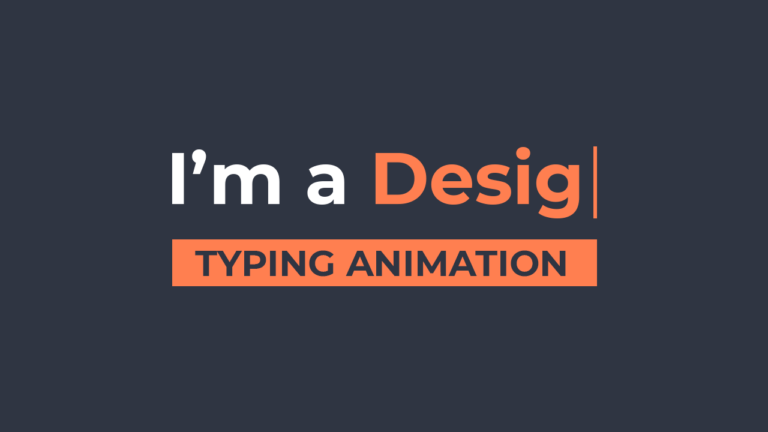
In this tutorial, we’ll explore how to create an engaging CSS text animation effect that gives the illusion of typing text dynamically. This project features a loop of animated text that changes between different roles, making it perfect for showcasing various skills or titles like “Youtuber,” “Blogger,” “Developer,” “Designer,” and “Gamer.”
Let’s dive into how to implement this animated text using CSS effectively.
Step 1: Setting Up the HTML
We start with a simple HTML structure for our animated text. Here’s the code:
<!DOCTYPE html>
<html lang="en">
<head>
    <meta charset="UTF-8">
    <meta http-equiv="X-UA-Compatible" content="IE=edge">
    <meta name="viewport" content="width=device-width, initial-scale=1.0">
    <title>Text Typing Animation</title>
    <link rel="stylesheet" href="style.css">
</head>
<body>
    <div class="animated-text">
        I'm a <span></span>
    </div>
</body>
</html>
In this code, we have a <div> with the class animated-text, which will contain our dynamic text. The <span> tag is where the animation will take place.
Step 2: CSS Text Animation
Next, we’ll define the styles in the style.css file. The following CSS will create our text loop animations, providing a smooth typing effect with color and cursor animations.
body {
    margin: 0;
    padding: 0;
    background-color: #2f3542;
    color: #fff;
    height: 100vh;
    display: flex;
    align-items: center;
    justify-content: center;
    font-family: "Montserrat", sans-serif;
}

.animated-text {
    font-size: 34px;
    font-weight: 600;
    min-width: 280px;
}

.animated-text span {
    position: relative;
}

.animated-text span::before {
    content: "Youtuber";
    color: #ff7f50;
    animation: words 20s infinite;
}

.animated-text span::after {
    content: "";
    position: absolute;
    width: calc(100% + 8px);
    height: 100%;
    background-color: #2f3542;
    border-left: 2px solid #ff7f50;
    right: -8px;
    animation: cursor .8s infinite, typing 20s steps(14) infinite;
}

@keyframes cursor {
    to {
        border-left: 2px solid #ff7f5000;
    }
}

@keyframes words {
    0%, 20% {
        content: "Youtuber";
    }
    21%, 40% {
        content: "Blogger";
    }
    41%, 60% {
        content: "Developer";
    }
    61%, 80% {
        content: "Designer";
    }
    81%, 100% {
        content: "Gamer";
    }
}

@keyframes typing {
    10%, 15%, 30%, 35%, 50%, 55%, 70%, 75%, 90%, 95% {
        width: 0;
    }
    5%, 20%, 25%, 40%, 45%, 60%, 65%, 80%, 85% {
        width: calc(100% + 8px);
    }
}
Explanation of the Code
- Body Styling
- The body is set to a dark background color to enhance contrast and focus on the animated text. Flexbox is used to center the content vertically and horizontally.
- Animated Text Styling
- The
.animated-textclass styles the text with a larger font size and weight.
- The
- Animation with Pseudo-elements
- The
::beforepseudo-element is used to display the currently animated word, which changes according to the keyframes defined in the@keyframes words. - The
::afterpseudo-element creates a cursor effect that simulates typing. The cursor blinks and appears as though it’s typing out the text.
- The
- Keyframes for Animations
- The
wordskeyframe defines the different roles displayed over time. - The
cursorkeyframe creates a blinking effect for the cursor. - The
typingkeyframe manages the width of the text, simulating the typing effect by expanding and collapsing the width of the animated text.
- The
Step 3: Testing and Customizing
To see the animation in action, open your HTML file in a web browser. You’ll observe how the text smoothly transitions between the different roles, creating an engaging effect for viewers.
Feel free to customize:
- Text Content: Change the words in the
wordskeyframe to fit your specific needs. - Animation Speed: Adjust the
20sin the animation properties to speed up or slow down the transition between words. - Colors: Modify the colors to match your brand’s theme.
Conclusion
Creating CSS text animation effects like this can significantly enhance the visual appeal of your website. This simple yet effective technique showcases your creativity and can be used in various applications, such as introducing yourself or highlighting your skills.
Stay tuned for more tutorials on JettCoding, where we will continue to explore the fascinating world of CSS animations!

